
How to make data in charts and graphs ‘more consumable’
January 2023—The acclaimed film composer John Powell said, “Communication works for those who work at it.” A sentiment to which Yonah Ziemba, MD, adhered when communicating data via charts, graphs, and tables during his pathology fellowship—benefiting himself and others.
“In pathology, our data is deeper and richer, so if we get better at presenting our data, we will have a very important seat at the table,” says Dr. Ziemba, assistant professor in the Department of Pathology and Laboratory Medicine, Northwell Health, New Hyde Park, NY.
During his pathology fellowship at Northwell, he explains, “I started noticing that everyone realizes when they need help accessing data, because if you don’t have it, you don’t have it. But not everyone realizes when they need help with how to present the data.”
This led Dr. Ziemba to research data visualization for his own presentation purposes and to help colleagues redesign their charts and graphs to be easier to understand and more impactful. Over time, he developed a set of tips to help pathologists avoid common data-visualization mistakes.
Darci Block, PhD, laboratory director for the central clinical laboratory at Mayo Clinic, attended Dr. Ziemba’s data-visualization presentation at the Association of Pathology Informatics’ 2022 Pathology Informatics Summit. She was sufficiently impressed that she invited him to speak at a recent clinical chemistry grand rounds at Mayo Clinic.
“Our goal when we publish data should be to accurately represent it but also to make it more consumable,” Dr. Block says. “The improvements he suggests make data more consumable, which is, in turn, going to help people better appreciate the message of the presentation or publication.”
Following are common data-visualization mistakes in pathology, according to Dr. Ziemba, and tips for avoiding them.

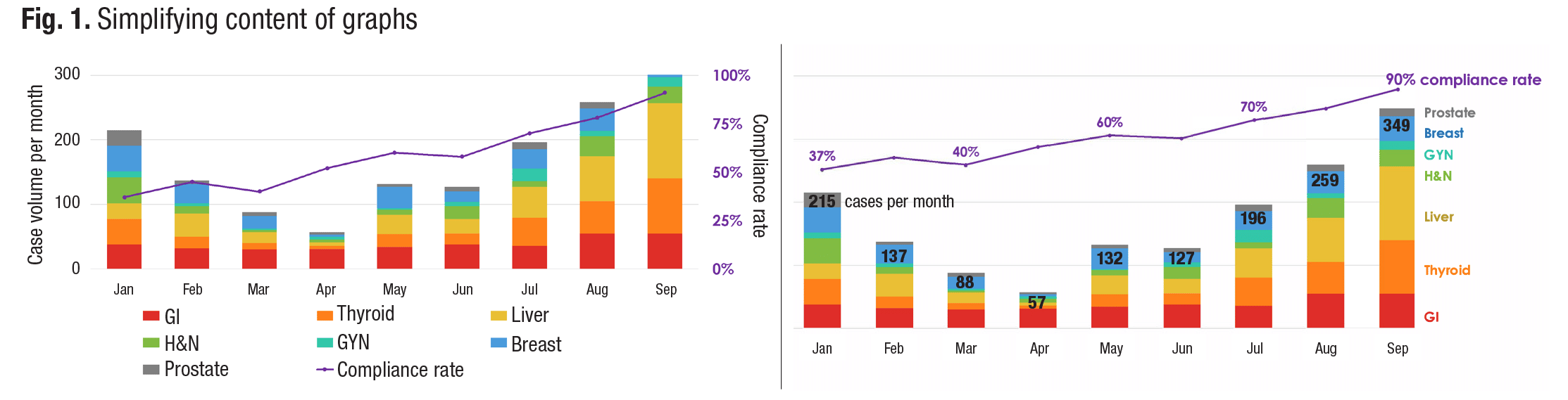
Multiple axes. One of the most visually confusing components of a graph are vertical axes on the left and right sides displaying different types of measurements, Dr. Ziemba says. This often occurs when two representations are superimposed, such as when a line graph showing the monthly percentage of pathology reports processed within a two-day turnaround is superimposed on a bar chart listing total pathology cases each month. While it sometimes makes sense to superimpose data, he continues, requiring people to draw a mental line to one side of the chart and then another mental line to the other side is too much to ask.
The simple solution: Label the line graph and bar chart directly, Dr. Ziemba says. If there were 137 pathology cases in February, for example, place the number 137 above or inside the February bar in the chart. This way, people viewing the chart do not have to draw imaginary lines to the side of the page to try to figure out the height of the February bar. Label key data points in the line graph in a similar manner, he says (Fig. 1).
The legend. A legend might seem like a helpful way to identify various elements in a chart or graph, but it forces viewers to look away from a graphic to find the labels they need, Dr. Ziemba says. Instead, he advises, color code and label each component. If, for example, a pathologist labeled a green slice of pie “chemistry” and a blue slice of pie “hematology” in a pie chart of pathology test volumes, the viewer could quickly and easily digest the information without having to scan the legend to determine what each color represents.
The process of looking back and forth from a chart to a legend requires conscious effort, Dr. Ziemba says. This conflicts with the data-visualization goal of designing charts with preattentive attributes, which are features that people will automatically understand before they realize they are paying attention.
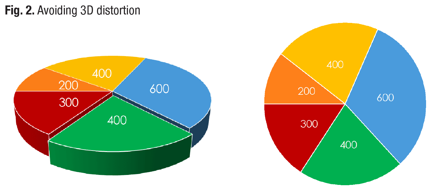
Three-dimensional displays. While three-dimensional imagery may make figures in a chart pop from the page, it can also create visual distortion, Dr. Ziemba warns. Imagine if a 3D pie chart were lying on the ground. A 21 percent slice of pie in the foreground would look significantly larger than a 21 percent slice on the far side of the pie (Fig. 2).
In a similar manner, “if you are looking down from the top of the Empire State Building at the other skyscrapers,” he says, “they suddenly don’t look as tall as they did when you were on the sidewalk. It’s the same type of thing.”
Bar charts can also be distorted by 3D graphics, Dr. Ziemba says. When bars are rendered in 3D, the depth of a pillar can appear to add to its height, making it harder for viewers to discern where the top of the bar ends.
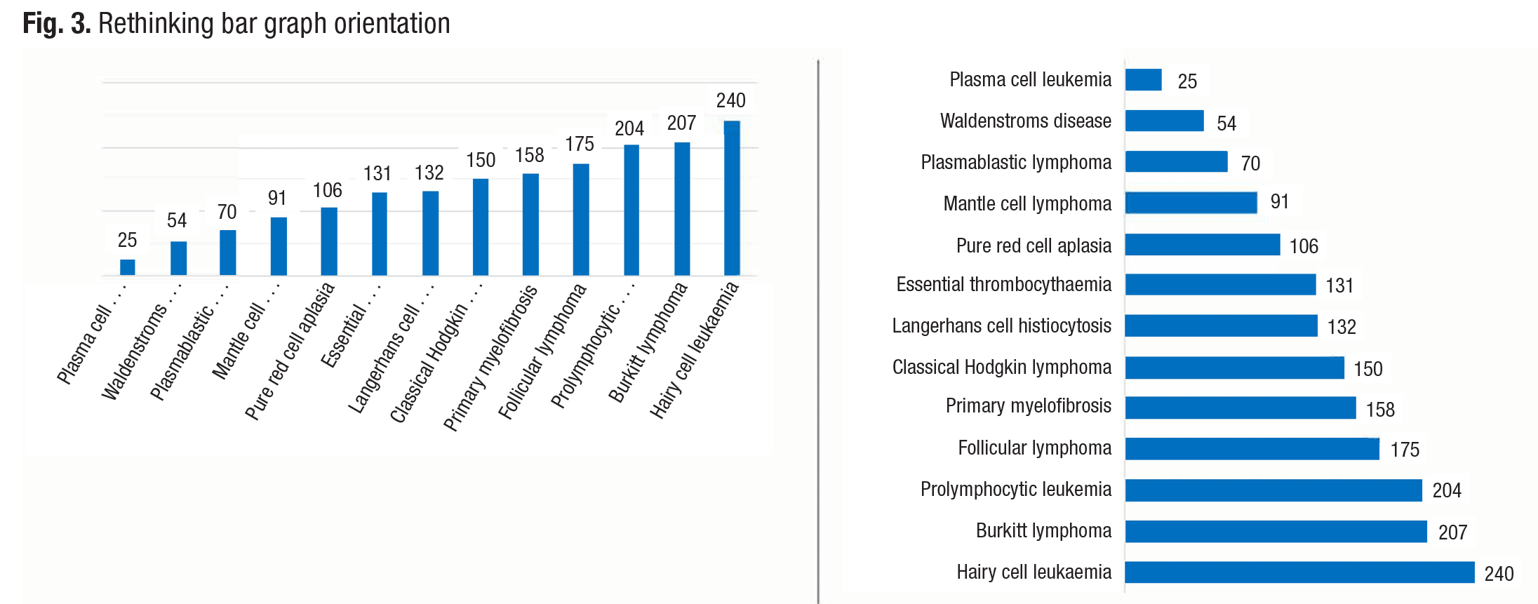
Long vertical labels. Bar graphs are often displayed as a group of vertical bars, but when each bar has a long textual label, the graphic may benefit from a horizontal orientation, Dr. Ziemba says. If each bar in a bar graph represents the number of cases of a specific disease—plasma cell leukemia, mantle cell lymphoma, and pure red cell aplasia, for example—it could be difficult to fit each disease name under a vertical bar in a graph. By turning the graph on its side, long disease names can run horizontally to the left of horizontal bars and still allow room for the varying lengths of the bars (Fig. 3).
Default software settings. People often assume the default graph setting in a software program is the best visual choice, but that’s not always the case, Dr. Ziemba says. Microsoft Excel’s default setting, for example, uses a visually jarring blue and orange color combination in bar graphs. The text is too small, and the bars are spaced so far apart that it’s hard for viewers to see the big picture that the graph is trying to create, he adds.
The Microsoft Excel default setting also floats a chart name in the white space above the chart bars and does not label axes. The location of the chart name can be distracting and usually must be removed for medical journals, which tend to put the chart names in the captions, Dr. Ziemba says. Furthermore, the lack of axes labels can cause ambiguity. “Always have axes labels,” he continues, “which often eliminate the need for a chart title.”
The inappropriate pie chart. One thing that a pie chart can do better than any other graphic is illustrate when one element is greater than all the other elements in the chart combined, Dr. Ziemba says. “In a bar chart, you would not easily see that the biggest bar is bigger than everything else combined, but the reason you can see that in a pie chart is because your eye is drawn to the angle at the center,” he explains.
Yet pie charts underperform in many situations. For example, it is not advisable to place two pie charts side by side for comparison purposes because similar elements do not appear next to each other, Dr. Ziemba says. Pie charts also should not be used for data with a linear progression, such as age. Ages should be displayed in a line from youngest to oldest. Furthermore, he adds, cutting pie charts into too many pieces reduces their visual impact.
Too much data. While graphs and charts can be visually stimulating, it is possible to provide viewers with too much information in such formats, Dr. Ziemba says. Therefore, it is often better to state information that represents a single data point within text instead of burying it in a chart that readers will have to decipher. “Don’t show data just because you have it,” he cautions.
Most importantly, consider charts and graphs to be tools for telling a story with data, Dr. Ziemba says. Pathologists should keep the differing perspectives and needs of viewers in mind when telling that story.
These tips can help pathologists “reduce the cognitive load” of their visual data representations, Dr. Ziemba says. “When it comes to spotting trends and understanding the significance of the data on display,” he adds, “you want viewers to instantly see it.”
—Renee Caruthers
CompuGroup Medical acquires Medicus
CompuGroup Medical US has purchased Medicus Laboratory Information Systems from Diagnostic Systems Consulting.
Medicus is a provider of laboratory-management software, middleware, and laboratory consulting services. The company has installed its Medicus LIS in more than 1,000 laboratories nationwide.
“The acquisition of Medicus will further enable CompuGroup Medical to grow its relationships with large, value-added resellers in the U.S. health care market,” according to a CGM press release. “CGM will also be able to leverage the expansive Medicus network of health care organizations and consultants selling its LIS solutions.”
Medicus’ LIS team will become part of CompuGroup Medical US, which offers a product portfolio that includes the CGM LabDaq, CGM SchuyLab, and CGM AP Easy laboratory information systems.
CompuGroup Medical, 800-359-0911
FTC updates tool to assist mobile app developers
The Federal Trade Commission has released an update to the online, interactive Mobile Health Apps Tool, which provides developers of mobile health applications with information about federal laws relevant to designing, marketing, and distributing such products.
The tool provides a list of questions to help users assess whether specific federal laws apply to the apps they are developing based on what the tool will do, how it will be used, how users will get it, and who will use it. It addresses the FTC Act and FTC health breach notification rule; Health Insurance Portability and Accountability Act privacy, security, and breach notification rules; Federal Food, Drug, and Cosmetic Act; 21st Century Cures Act health IT and information-blocking provisions; ONC Cures Act final rule; and Children’s Online Privacy Protection Act.
“Whether you are a developer new to mHealth, focusing on different users than you have with prior mHealth products, or are building innovative features into an existing app focused on the same kinds of users, the Mobile Health Apps Tool can serve as a sort of ‘trail guide’ to these federal laws centered on information governance and federally required protections for information related to an individual’s health, as well as the safety and effectiveness of medical devices—which some mobile health apps might be,” according to an ONC Health IT Buzz blog post.
The ONC noted that developers of mobile health apps may also be subject to federal and state laws that are outside the scope of the Mobile Health Apps Tool.
The tool was revised as part of a collaborative effort between the FTC, Health and Human Services’ Office of the National Coordinator and Office for Civil Rights, and the FDA.
Dr. Aller practices clinical informatics in Southern California. He can be reached at raller@usc.edu. Dennis Winsten is founder of Dennis Winsten & Associates, Healthcare Systems Consultants. He can be reached at dwinsten.az@gmail.com.